TAROT READER
UNTAMED TAROT
A tarot reader seeking a logo and business card that portrays the wild and knowledgeable
green witch that she is.
Logo Design
Business Card Design
Brand Identity

THE PROJECT
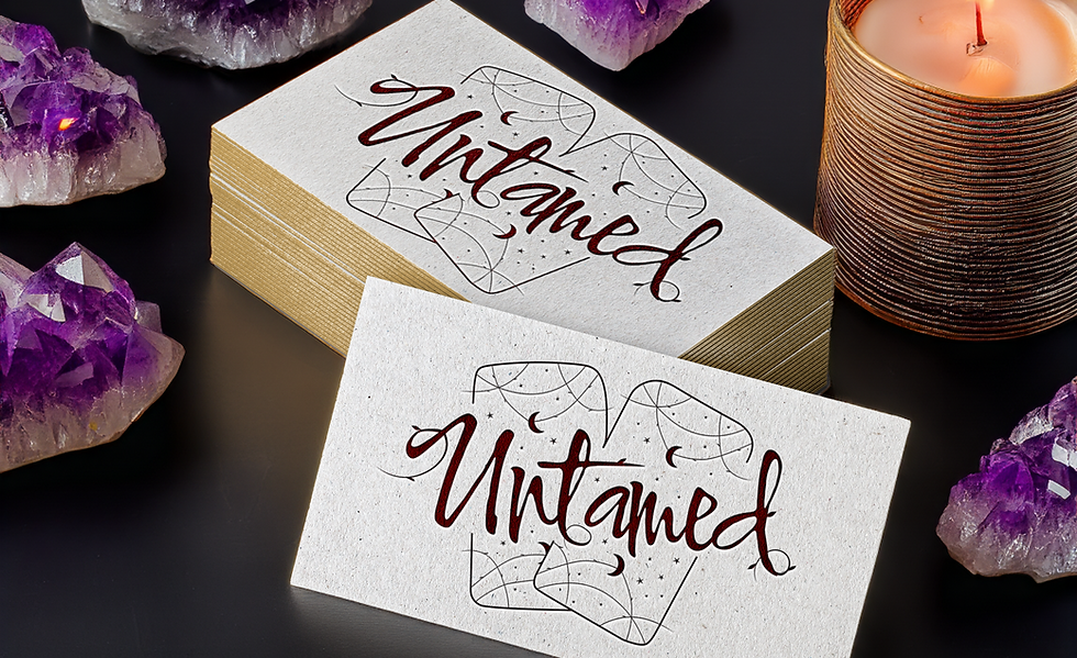
A tarot reader wanted a bold, mystical logo and a business card that resembled a tarot card. She was looking for a modern, intricate design that was wild while maintaining the mystical essence of tarot. The specific request was to have two tarot cards with the business name and make it look wild.
With knowledge of tarot and a few decks on my shelf, it was easy to ask the client questions like, what's her tarot number, what card most resonates with her, and what kind of witch is she. With the answer being a green witch, it made sense to go with vines and greenery as the wild element in the logo.
THE DESIGN
I designed a logo with spiritual elements like stars and moons, using bold, customized typography with vines extending out of the letters and tarot cards to give the wildness she requested. The colour palette of deep reds and gold conveys mystery, power, wisdom, enlightenment, and spirituality.
The business card was designed to look like a tarot card, using a custom image of a woman meant to represent the high priestess, with the business name as the card name. To add a little oomph to the card, I recommended matte cardstock with a gold foil finish for the logo and design. This gives the business card a realistic tarot card feel, making it more memorable and collectible.
The designs balance mystical elements and wild aesthetics, creating a logo and business card that truly felt personal to the client and her practice.


